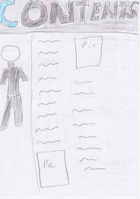
For my Front cover, I've chosen to make the artist pose as T.I has for Vibe magazine because when I came across this pose it seemed that T.I had a lot of authority and seemed like he was the boss. The colour scheme I have chosen for the magazine is Blue, Black and White. I've chosen this because I feel the colours are more masculine and also in normal Rap and RnB magazines the main colour scheme is Red, Black and White, therefore I wanted to create something different.
For my double page spread I want to create the artist in a mirror image because my article will be based on 'the man in the mirror'. I've chosen my article to be about this because I feel that a life of a music artist had two sides, one were the artist is serious and the other when the artist is having fun.


No comments:
Post a Comment